

Bohemian Printed Carpet Which One Is Best for Your Space
2026-10-10
Bohemian printed carpets are everywhere right now, but not every pattern earns its place in your home. The wrong one can make a room feel chaotic instead of cozy. That's why we're breaking down the most wearable styles—from subtle kilim-inspired prints to statement Moroccan trellises—so you can find the one that actually fits your space. Senseco has curated the top options worth your attention.
Why Some Bohemian Rugs Feel Instantly Right in a Room
Bohemian rugs often carry small imperfections—slightly uneven borders, a motif that doesn’t quite repeat, a patch where the dye ran softer than intended. Those quirks do something quiet but powerful in a room: they make the floor feel lived-in before you’ve even arranged the furniture. A perfectly symmetrical rug can sit under a space like a formal guest; a boho rug stretches out like it has already heard a hundred conversations.
The color is another reason. Instead of a single saturated field, many of these rugs layer faded terracotta next to dusty rose, olive, and a blue that’s nearly grey. That mix acts as a buffer. Bright walls, dark wood, mismatched chairs—none of them have to fight for attention because the rug has already absorbed the extremes. It gives the eye a place to land without demanding it stay there.
There’s also a sense of weight and age. Even a brand-new bohemian rug often mimics a piece that has been walked on for decades, and that suggestion of history makes a room feel settled rather than staged. You can put it under a sleek sofa or a flea-market bench, and it will hold both without flinching. That’s the trick: it doesn’t try to match anything, so it somehow matches everything.
Matching Pattern Energy to the Pace of Your Space
A room that hums with conversation and foot traffic can carry louder, more rhythmic patterns without feeling chaotic—think overscaled florals, bold stripes, or a tile motif with real contrast. These spaces thrive on visual momentum, so the pattern should lean into that current rather than fight it.
Quieter corners ask for a softer pulse. Instead of repeating motifs or high contrast, let pattern energy drop to something like a washed-out check, a loose toile, or a small geometric that reads as texture from across the room. The pace here comes from restraint—enough detail to hold the eye, but not so much that it becomes the whole conversation.
The trick is to notice how the room already moves. A hallway moves fast, a bedroom settles, a dining room lingers. Match the pattern's internal rhythm to that tempo and the space will feel more composed, as if every element arrived at the same conclusion on its own.
The Material Detail That Changes How a Carpet Ages
Most people blame foot traffic for a carpet's decline, but the real tell is in the yarn twist. A tightly twisted, multi-ply wool keeps its spring under years of shoes and vacuums; the fibers push back instead of flattening. Loosely spun yarn, on the other hand, starts to mat within months, trapping dirt and turning shiny in the same spots no matter how often it's cleaned.
That twist also changes how color wears. In a high-twist pile, the cut ends point upward and scatter light unevenly, so minor crushing reads as soft patina rather than damage. Over a decade, the carpet doesn't just fade—it develops a depth that flat, low-twist synthetics never reach.
Look at the back of a sample before you buy. Peel the fibers apart and count the plies, feel whether they spring back. If the yarn untwists with a gentle rub, it will do the same underfoot. The ageing you get isn't an accident; it's built into that first spin.
Small Room, Bold Print: Knowing When to Go Big
The first impulse in a compact room is to keep every surface hushed, but that usually just makes the space feel unsure of itself. A single oversized motif—a branching botanical, a thick painterly stripe, or a loose geometric—gives the eye a clear anchor and distracts from the room's actual dimensions. The goal isn't to punish yourself with tiny patterns; it's to use one big statement deliberately.
Choose one surface to carry the pattern and let everything else step back. If you're going with a large floral on a single wall, keep the sofa and floor solid, or echo just one of the print's quieter tones in a cushion or a woven rug. That restraint makes the boldness feel composed instead of chaotic. A dark-ground print can work beautifully in a small room, provided the surrounding walls are lighter and the lighting is warm enough to keep it from closing in.
Scale matters more than square footage. A big, loose repeat on a headboard, a single curtain panel, or a slipcovered chair often reads as more spacious than a busy all-over micro-print that makes the room feel crowded. If you're nervous about committing, start with a removable piece—a framed textile, a throw, or a slipcover—and live with it for a few days. You'll quickly learn whether the pattern opens the room up or simply shouts over it.
Color Stories That Anchor Eclectic Decor
In eclectic rooms, where a mid-century armchair rubs shoulders with a Moroccan pouf and a vintage brass lamp, color often does the quiet work of making it all feel inevitable. A saturated terracotta on one wall or a cobalt blue ceramic collection can act like a conductor, pulling disparate pieces into a single visual rhythm. The trick is to treat color not as a backdrop but as a recurring character—appearing in a rug, a framed print, a stack of books—so the eye traces a consistent story across the room’s patchwork of styles.
One practical route is to anchor the space with a dominant hue borrowed from the most commanding object in the room, then scatter its echoes at varying intensities. If a faded kilim pillow carries a dusty rose, let that rose appear again in a glazed vase, a stripe of wallpaper, or the inside of a bookshelf. These repetitions don’t need to match perfectly; slight shifts in tone feel more collected than curated. The result is a space where each disparate find seems to have been waiting for the others, tied together by a palette that feels remembered rather than planned.
Avoid treating every wall as a neutral envelope. A deep aubergine ceiling or a narrow column of mustard yellow can give the room a spine, allowing bolder juxtapositions—a chrome floor lamp next to a bamboo side table—to read as intentional rather than chaotic. The color story doesn’t shout; it hums beneath the surface, giving the eclectic mix a sense of arrival.
From Kilim to Moroccan: Picking a Motif That Sticks
Kilim rugs carry a language of sharp angles and repeating diamonds, often with a hand-woven irregularity that makes each piece feel like a found object. Moroccan motifs, by contrast, lean into softer geometry—trefoil arches, octagonal lattices, and the occasional Berber symbol that hints at protection or fertility. When you're deciding which direction to take, don't just chase what looks good in a styled photo. Pay attention to how the pattern's rhythm works with the rest of the room. A busy Kilim can overwhelm a space already full of art and shelves, while a quieter Moroccan lattice might disappear under a heavy dining table.
Think about scale before you commit. A large all-over motif will read as a backdrop, while a small repeat creates texture without demanding attention. If your floors are dark or your walls are wallpapered, pick a motif that has some breathing room—white space or a solid border. And don't be afraid to mix influences. A Moroccan trellis in muted indigo can sit surprisingly well next to a Kilim-inspired cushion, as long as they share a common color temperature. The goal isn't to match perfectly; it's to create a room where the eye can wander without tripping over a pattern that doesn't belong.
FAQ
Measure the seating area and aim for at least the front legs of your sofa and chairs to rest on the rug. An 8x10 or 9x12 usually anchors a medium-sized living room, while smaller spaces can handle a 5x7 if you keep it centered under a coffee table.
Earthy tones like terracotta, olive, mustard, and faded indigo add warmth without shouting. If your walls are white or beige, a rug with a mix of those hues plus a touch of cream can tie the room together without overwhelming it.
Look for flatweave or low-pile options made from wool or a wool blend. They handle foot traffic well and hide minor wear better than high-pile shags. A hallway runner with a busy boho print also disguises dirt between cleanings.
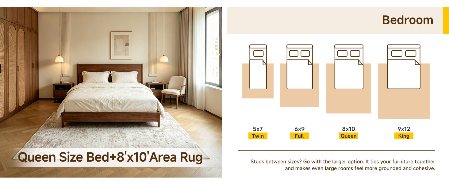
Yes, choose a rug that extends about two feet beyond the sides of the bed, or place a 4x6 at the foot. Lighter background colors and smaller-scale patterns keep the floor feeling open rather than busy.
A true vintage piece carries faded dyes and irregular wear that can't be replicated exactly. New printed versions often use modern dye techniques to mimic that patina. If you want softness underfoot and easy cleaning, a new low-pile printed rug is usually more practical; if you love one-of-a-kind character, go vintage.
Vacuum regularly with the beater bar off to avoid pulling fibers. For small stains, blot immediately with a damp cloth and mild soap, then air dry. Every six to twelve months, take it outside and gently shake or beat it to remove deep dust. Avoid harsh chemicals as they can fade the print.
A living room or dining area gains the most because the rug becomes a conversation piece. But a bold pattern can also elevate a plain entryway or home office. Just make sure the surrounding furniture stays relatively simple so the rug doesn't compete.
Contrast usually looks more intentional. If the rug has large floral or geometric motifs, pick curtains in a solid color pulled from one of the rug's minor shades. If you want pattern mixing, keep the curtain pattern small in scale and limit it to two colors already present in the rug.
Conclusion
Choosing a bohemian printed carpet isn't just about liking a pattern in a photo. The ones that feel instantly right tend to have a visual rhythm that matches the room's tempo. A busy, high-contrast motif can energize a quiet reading nook, while a softer, more repetitive print often settles a lively living area without adding noise. It's less about strict rules and more about noticing whether you want the floor to anchor the room or push it forward. If you walk in and the rug seems to hum at the same frequency as the furniture, that's usually the one.
Material quietly shapes how the carpet ages and how forgiving it is in daily use. A flatweave kilim or a low-pile wool piece will develop a worn-in character that feels collected rather than tired, making it a smarter pick for high-traffic zones. Small rooms don't have to shy away from bold prints; a large-scale motif can actually make a tight corner feel intentional instead of cramped, as long as the surrounding colors stay cohesive. For color, look to rugs that borrow from a space's existing palette but add one unexpected accent—terracotta, faded indigo, or mustard—to tie eclectic decor together. Whether you lean toward Moroccan latticework or Anatolian geometrics, pick a motif you won't tire of, since a good bohemian rug tends to stay put long after other trends move on.
Contact Us
Contact Person: Ivy Yin
Email: [email protected]
Tel/WhatsApp: +86 18519681805
Website: https://www.sensecomarketing.com/